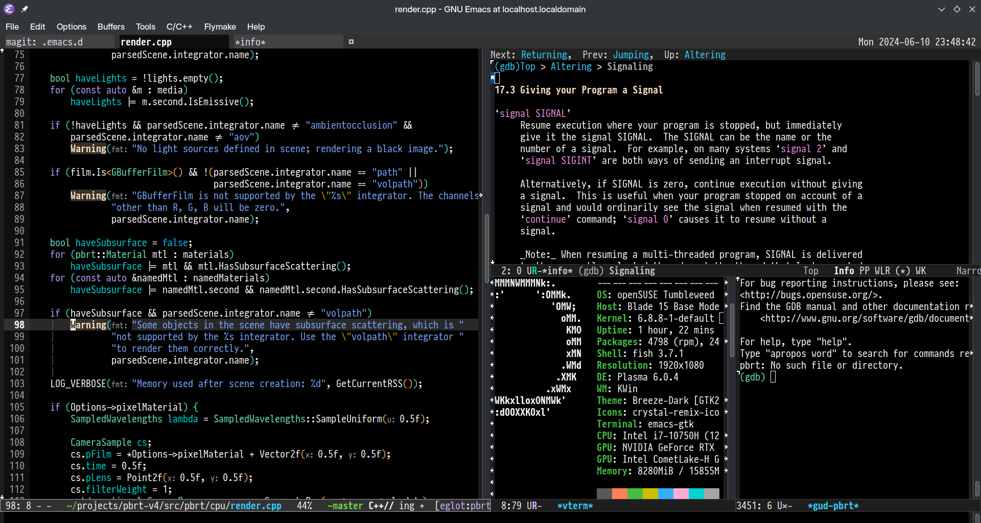
(I have now spent more time scrolling through fonts than I have on the new system that the final choice will be used on … )
Iosevka is my personal favourite, but will need to spend some time scrolling through
Input if you want something a little wider
what do you mean you don’t use Windlings?
Source Code Pro gang!
I like Cascadia Code
take a look at Monaspace Argon as an alternate
I’m already using it when i need a different typeface. Krypton looks nice for AI suggestions.
Here’s an out of the box suggestion: Dina Remastered II. It’s a pixel font, that since it has no curves, scales well on any screen. No sub-pixel nonsense.
I like Fira Code Mono w/ Nerd Font patch.
https://www.programmingfonts.org/#anonymous-pro Is what I use for terminal sessions. Not sure how I feel about it in an IDE. The color coding the most important part imo.
Been font jumping for a long time. Consolas, Fira, SF Mono, Input, Source Code Pro, Iosevka… finally settled on Pragama Pro. The font is quite expensive, but really worth it imo. It’s even sharper and clearer on macOS.

I was using Hack for a long time, but I think I’ll try out Borg Sans Mono and Inconsolata for a bit
Less Perfect DOS VGA is what I use in my terminal on my desktop since I use the Chicago95 theme.
OpenTTD Mono is also cool, though. It almost gives Apple Chicago font vibes.
Inconsolata and Cascadia are the best.
(Tweaked) Verdana FTW.
I liked proportional fonts for reading code - several of my favorite programming books used proportional fonts for code examples - so when Verdana was released in 1996 I switched to using it in my IDEs. I’ve had 27 years of pleasantly ergonomic coding - it has a high x-height, different 0/O, I/l/1, and impeccable hinting and kerning. ❤️❤️❤️
I think I’ve tried nearly every monospace typeface over the years and I’ve finally settled on JetBrains Mono for more than 2 years now, though IBM Plex Mono is a close second.


