I don’t understand this. People have been nostalgic for windows 7 aero for years. I maintained since 7 came out that aero was the best windows UI ever made. It’s so pretty and functional. I run Linux with an aero theme to this day.
Why all of a sudden does everyone hate the glass look? It’s like a switch flipped.
Edit: Ah I get it. It’s not necessarily the glass aesthetic but apple’s implementation along with some of the functionality. I didn’t actually realize this had to do with Apple at all haha.
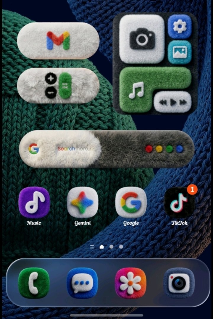
I don’t dislike aero or glass, I just dislike iOS implementation of it. With the wrong background sometimes you can’t read buttons for example, and a myriad of little things that are insignificant on their own but a pain in numbers.
This is with the extra brightness and contrast added by the iOS screenshot functionality during screenshot. I would need a second phone to truly show you the horror of liquid
I’ll join in and say that I also don’t understand the hate. I get the readability and accessibility stuff, but as far as pure aesthetic, I personally really enjoy it. I haven’t run into the supposed complete workflow hitches that others seem to have with it.

I don’t understand this. People have been nostalgic for windows 7 aero for years. I maintained since 7 came out that aero was the best windows UI ever made. It’s so pretty and functional. I run Linux with an aero theme to this day.
Why all of a sudden does everyone hate the glass look? It’s like a switch flipped.
Edit: Ah I get it. It’s not necessarily the glass aesthetic but apple’s implementation along with some of the functionality. I didn’t actually realize this had to do with Apple at all haha.
Windows 7’s Aero was amazing. Liquid Glass is terrible.
I don’t dislike aero or glass, I just dislike iOS implementation of it. With the wrong background sometimes you can’t read buttons for example, and a myriad of little things that are insignificant on their own but a pain in numbers.
This is with the extra brightness and contrast added by the iOS screenshot functionality during screenshot. I would need a second phone to truly show you the horror of liquid
I’ll join in and say that I also don’t understand the hate. I get the readability and accessibility stuff, but as far as pure aesthetic, I personally really enjoy it. I haven’t run into the supposed complete workflow hitches that others seem to have with it.