sirdorius@programming.dev to linuxmemes@lemmy.world · 3 months agoDual booting into Windowsprogramming.devimagemessage-square51linkfedilinkarrow-up1555arrow-down15
arrow-up1550arrow-down1imageDual booting into Windowsprogramming.devsirdorius@programming.dev to linuxmemes@lemmy.world · 3 months agomessage-square51linkfedilink
minus-squaresirdorius@programming.devOPlinkfedilinkarrow-up118arrow-down1·3 months agoI wanted to use the current Windows logo, but it’s so incredibly stupid, you wouldn’t even recognize it. This is what happens when a $100 bn profit/year company is too cheap to hire artists:
minus-squareinari@piefed.ziplinkfedilinkEnglisharrow-up81·3 months agoIt’s just the blue screen of death now. Apt.
minus-squareAuster@thebrainbin.orglinkfedilinkarrow-up24·3 months agoI think it’s a projection joke. Win12 isn’t even released yet.
minus-square87Six@lemmy.ziplinkfedilinkarrow-up5arrow-down1·3 months ago12? Even 11 isn’t out yet. Or at least I haven’t heard.
minus-squaremagnue@lemmy.worldlinkfedilinkarrow-up31·3 months agoTIL windows 1 logo was the best logo
minus-squareBladeFederation@piefed.sociallinkfedilinkEnglisharrow-up7·3 months agoThere’s also this gem that was used infrequently around 3.0 era. I call it Windows Noir.
minus-squareThunderbird4@lemmy.worldlinkfedilinkarrow-up6·3 months agoIt does kinda look like a cafeteria tray, though.
minus-squareprole@lemmy.blahaj.zonelinkfedilinkarrow-up4·edit-23 months agoYeah that logo is better than the modern logos by far
minus-squareMeron35@lemmy.worldlinkfedilinkarrow-up7·3 months agoIronically it’s because they paid very expensive artists. The windows 8 logo was done by Paula Scher of Pentagram, one of the most exclusive and expensive graphic design firms. Meeting with Microsoft early in the development process, Pentagram asked: “Your name is Windows. Why are you a flag?” Windows - https://www.pentagram.com/work/windows/story
minus-squareArkthos@pawb.sociallinkfedilinkarrow-up2·3 months agoThat was a pretty interesting read. I definitely do think there’s more artistic merit to the windows 8 logo than 11.
minus-squareBlue_Morpho@lemmy.worldlinkfedilinkarrow-up7·3 months agoYou think they didn’t pay marketing consultants millions for that logo?



I wanted to use the current Windows logo, but it’s so incredibly stupid, you wouldn’t even recognize it.
This is what happens when a $100 bn profit/year company is too cheap to hire artists:
It’s just the blue screen of death now. Apt.
I think it’s a projection joke. Win12 isn’t even released yet.
12? Even 11 isn’t out yet. Or at least I haven’t heard.
Window
s12TIL windows 1 logo was the best logo
There’s also this gem that was used infrequently around 3.0 era. I call it Windows Noir.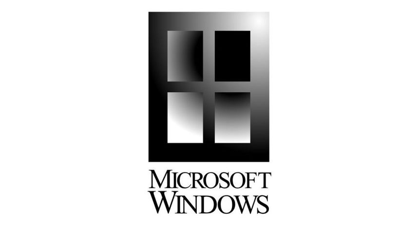
It does kinda look like a cafeteria tray, though.
Lunch? Even better!
Yeah that logo is better than the modern logos by far
I like 7 best
Ironically it’s because they paid very expensive artists.
The windows 8 logo was done by Paula Scher of Pentagram, one of the most exclusive and expensive graphic design firms.
Windows - https://www.pentagram.com/work/windows/story
That was a pretty interesting read. I definitely do think there’s more artistic merit to the windows 8 logo than 11.
You think they didn’t pay marketing consultants millions for that logo?