Alt text: A line plot with 2 axis (confidence vs competence) referencing the Dunning-Kruger effect with various distro logos placed at different points on the line. Starts with mint/ubuntu near (0,0) and progressing through multiple distros to end up with opensuse/fedora at what it calls “the plateau of sustainability”
I assume Hannah Montana Linux is off the chart to the right
Hannah Montana Linux, or HM/Linux as I’ve taken to calling it, is the sign of true civilization.
Users often achieve enlightenment and can simultaneously interact with many planes of existence - that just can’t be shown on a 2D chart for us plebs.
deleted by creator
why is manjaro there twice? it’s a horrible experience no one in their right mind would return to
“Maybe I was the problem?”
they managed to make arch less stable, never update their ssl cert, and every installation slowly falls apart until it’s unusable… sure, I’m the problem
My system I installed 10 years ago is unusuable now?
“I donated money to them so I am going to use it.”
Although not much, just 20 EUR. Not sure how much the bundled Windows license costs, but surely Microsoft has other ways to earn from spyware.
I love my Manjaro. I always come back to it… but I may not be in my right mind.
To be fair, it’s OK. Just you might want to check out EndeavourOS when you need to format your PC again.
I have both and I like them almost equally.
I think I’ve seen this story before. :P

I love that !
Everything is in the “almost” 😅
Fedora is also there twice.
This is perfectly normal.
It also works with a Gaussian: (Noob) haha Fedora go brrr -> (angry advanced) nooo you must use Arch/Nix/Gentoo/Slackware -> (Linus Torvalds) haha Fedora go brrr
Fedora fucked up my PC way more times in a year than Gentoo did in 3.
I’m not leaving Gentoo.
I’ve updated fedora releases for like 10 years with zero issues, even went from one laptop to the other and dd’d three times to new SSDs without reinstalling.
I think it may be you who fucked up your PC.
It was nvidia drivers mostly.
And it was 12 years ago.
Yeah I had lots of problems with Winmodems on Slackware 20 years ago, definitely a bad distro too!
I switched to Ubuntu then and has no issues since.
So yeah.
Except Fedora is actually fine as an option. Though I had my share of troubles setting it up, and their decision to ditch X11 forced my hand to OpenSUSE when I went for it the second time. Had no regrets so far.
Look, don’t judge me, but manjaro has been the only distro to just work. I haven’t been fucked by nvidia drivers that I know of, I haven’t had any glaring issues… I’m not saying I disagree with the criticisms, but as a ‘just use the fucking computer’ distro, it’s great.
Manjaro’s fine. Most of their problems were years ago. If it works for you, don’t listen to the mob.
Manjaro is awesome. The hate is not deserved and as you said, everything just works perfectly.
As someone who ran Manjaro as my first Linux for 1,5 years, it’s a breeze to set up and everything just works…until it doesn’t.
What screws it is that eventually, over time, something goes wrong. Something breaks here and there, new bugs appear, and without Arch proficiency that is not really expected of a Manjaro user, it’s next to impossible to track it down. So, eventually one has to reinstall.
I’ve been a strong Manjaro proponent back in the day, but now I see its flaws, unfortunately. I wish it could be a great option, though.
Lol, that does make me wonder. I think I changed the boot process from silent to visible at one point, because it wouldn’t boot if the silent option was enabled.
That’s…very odd :D
Especially if it was GRUB. This thing normally just works on any distro, even the less stable ones.
Yeah, it was grub. I changed it to see if I could find where it was hanging in the boot process, but as soon as I made the change it would simply boot without issue.
Removed by mod
Manjaro is a tempting option when you want Arch without being competent enough to confidently operate Arch.
Been there before. Had it for over a year for the first time, but quickly noped out on the second try.
Mint, and I’ll stay with mint. Perhaps I’m not a good Linux user material, but I just want something that works and doesn’t get into the way. You know: a reliable, unobtrusive operating system.
And there’s no shame in that! Use whatever works for you and don’t let anyone tell you otherwise.
There is SO MUCH shame in that, the pitiful noob wont even learn to RTFM, and then I’ll have no way to feel superior to them as I dip my beard into my off brand morning cereal #frostedfakes
Mint is just perfectly fine, don’t listen to the naysayers.
As the old observation goes, novices use something like Mint because it’s there, and it works; intermediate users use something like Arch because they want the control to tweak things in the greatest depths; experts use something like Mint because it’s there, and it works.
Same here. I started with mint 10 years ago, fucked around and came back to it.
Not a Dev, but I work in tech, so it does most of the things I want and can tinker with nascent projects without blowing my foot off.
Using mint doesn’t mean you’re bad at Linux using arch doesn’t mean you’re good at it.
Mint is the start and the end for a lot of people for good reason.
Same here, played around, but mint keeps pulling me back in. 10+ years going strong
I like it because when I have an issue, the ones for Ubuntu and Debian also work.
Mint is fine. If you love it, there’s no reason to leave. Personally, I’m a fan of KDE and I strongly dislike the retro-Windows feel of Cinnamon so I settled on Fedora after Mint dumped its KDE edition.
Which is exactly what OpenSUSE/Fedora have to offer. It just works and doesn’t get in the way. The only real difference between them and Mint in terms of user experience is that they require some more proficiency with the terminal and experience with Linux overall and do not assume user to be a complete newbie.
So, you’re on the right track with Mint. It holds to nearly the same philosophy, and offers you the tools you may find useful as a less proficient user. Keep it up!
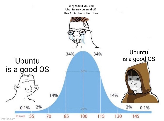
Meh, I’m relatively experienced and just use Ubuntu
deleted by creator
“Not a part of your personality” then “PopOS, btw”
deleted by creator
I’ve been using Linux since you created a boot floppy by using
ddon the kernel. I use Ubuntu because I just want something that works, is stable in the LTS sense of the word, and I don’t have to futz with. I’ve heard enough about Mint now that I’ll probably switch over to it when I build my next machine in several years.I’ve been using Linux since you created a boot floppy by using dd on the kernel
Wait, is that not how you do it anymore? I swear, I just went through trialing a few more distros, and I dded like crazy.
You might have been using
ddto burn an ISO image onto a USB stick or some such, but sincerely doubt that you were writing just the kernel to the first sector of a 3.5" floppy disk and then booting off of it, while it found your ISA hard drive.Ah, right. Totally different.
Same here, except I switched to Mint a couple years ago. You won’t be disappointed. And if you’re sanguine about waiting until you get a new machine, just go with LMDE.
Been maining Linux mint for 3 years now. I did distrohop once to nobara to see if the grass was greener on the other side, but had to revert due to Nvidia.
… The grass wasn’t green, but tasted exactly the same. Apart from Nvidia (which isn’t a distro issue but more shitty company that can’t make things right), the only noticeable changes is going from cinnamon to KDE.
There’s no “stupid distro” nor “smart distros”. Everything is valid. (Although I’d argue that Linux mint is the best beginner distro, to let people get into Linux gently before eventually trying something else)
Debian servers in the streets, Kubuntu desktop in the sheets.
I use Ubuntu on the server too :3
I was going to say - what’s wrong with Mint?
I don’t feel the need to switch. Ubuntu serves me well. And I prefer GNOME
How’s the Wayland support in Linux mint?
Available and in active development. You can still use GNOME on mint, BTW.
I want to see a graph where X ranges from “ambitious” to “I’m so tired”, and Mint is at the end. That’s where I’m at.
Same. Mint was at the start too, though.
tried a few distros before mint because i thought it was less cool or whatever, but then it was the only one i could get working. every few months i try something else and come crying back…
Linux experts vastly overestimate the amount of annoyance average people will put up with. Most people just want it to work, and want to learn almost nothing. I don’t blame them, Linux is a means to an end.
Ragebait
i’m on NixOS
…and I’ve been on NixOS for mount stupid, valley of despair and, perhaps, the plateau of sustainability
Agreed, NixOS is all states in once all along. Don’t look inside the box to maintain incertitude.
This is funnier if you have mint or Ubuntu on both extreme ends.
That’s kinda the case here with Debian being on the extreme opposite of Ubuntu. I don’t see any benefit of putting up with the stability issues and complexity of other distros when Debian “just works”. And once you debloat Ubuntu you just get Debian.
That’s basically me
Starter on xubuntu, used arch for a couple years, got fed up by the system babysitting, now back again on (x|k)ubuntu
My guess before reading the comments:
“Everyone hated that.”
FIFY

Oh fuck of with this bullshit. This is why linux is not on more PCs, this distro elitism.
You’re on linuxmemes not Year of the Linux Desktop memes.
I prefer my memes with less smug condescending bullshit. But hey I am sure this sort of thing helps validate you, so go wacky.
I feel neither validated nor invalidated by the meme because its an image on the internet portraying a joke. I don’t think someone posting a meme in a community called Linux memes needs to be held to this holier than thou status. I don’t inherently agree with the meme myself, but I’m not going to sit here and get butthurt about an obvious in joke posted to that in group.
well they got arch correct.
i use arch btw.
Arch Enjoyers

A screenshot of Hellraiser, with Pinhead saying in caption “We have such sights to show you.”
Urgh, at least this helps my point.
It’s a meme sub though
100% agree, just more rage bait fuel for the fire
The Fedora propaganda is getting annoying.
It’s linuxmemes, you get the choice between that and debian propaganda.
I’ve always had issues with fedora and nvidia.
Same here…every time I get an update, my nvidia card stops working! And every time seems like the fix is different. I’ve been using fedora for 3 years straight now and gaming with my crappy nvidia card is awful.
I don’t really care about others but please avoid Manjaro they had some shady finances and apparently don’t manage their certs correctly
This probably outs me as an old fart, but my first computer experiences were with assembly and BASIC intepreters, then things like COBOL, Fortran, and Pascal.
I remember when Bill Gates got his panties in a wad over people sharing MS BASIC and always tried to steer clear of M$ products from then on, although I did have the common misfortune of having to use Windows in several work environments throughout my career. Luckily, the last I ever had to touch as an admin/user was Windows 7.
My personal desktop OS history is as follows:
Solaris -> OpenBSD -> Slackware -> Debian -> SuSE -> Mandrake -> Gentoo -> Redhat -> Fedora -> Sidux -> Arch -> OpenSUSE -> Mint.
I stick with Mint because I don’t want to spend my time tinkering on the OS, and it makes helping all the noobs/non-techies I have convinced to switch to Linux over the years that much easier. This is well over a hundred at this point, and you know who most of them come to when they have a problem. With Mint, they seldom have any issues.
The years I spent tinkering taught me a lot, especially on the rolling OSes, but these days I appreciate having a system that just works reliably, so I can spend my time tinkering on my own projects instead. I have VMs for other OSes as needed anyways.
Now you damn kids get off my lawn!
As someone who just installed Mint two months ago (after using Windows for 30 years), this makes me happy inside.
I use mint on my PC and love it! However I’m now the ipad kid of Linux. It never breaks, I never have to learn anything. Just getting it up and running is the zenith of my knowledge and ability.
Same here.
I can’t imagine daily driving open BSD for daily desktop use, and I use freebsd for my servers
