2006 🔥
Frutiger Aero my beloved. The apotheosis of skeuomorphic design, killed by a neverending downward spiral towards the least distinctive, creative, and inspired designs imaginable.
It’s really ironic that this design cycle coincided with the rise of high-DPI displays. All those pixels used to upscale monochrome boxes with square corners. What a tragedy.
I miss Aero
I miss it too. All this minimalist design and no soul.
Each one of those (except X) has the recycling image, indicating that it’s a recycle bin, not a trash bin, which is Windows.
If you want trash, you want macOS.
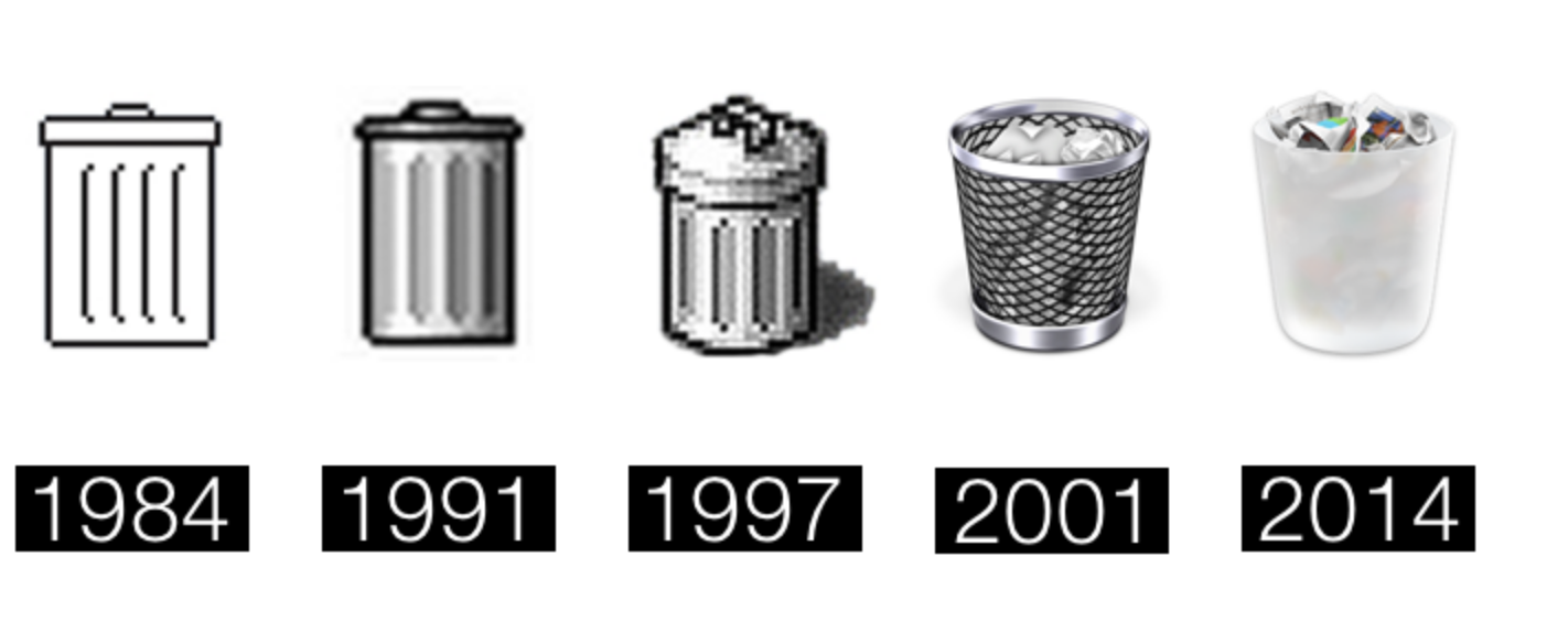
If you want trash, you want macOS.
Lol so true
that is disrespectful towards trash
Y’all been on Linux too long, it’s called the recycle bin, helllloooo (don’t hurt me)
(don’t hurt me)
What is love??? Baby don’t hurt me, don’t hurt me…no more…
linux penguin doing the headbob, and getting bounced around a club in between a spinning beach ball, and a swirl of colors in the shape of windows
What is love???
euphoniums blare in the background
I’ve been on Linux just long enough. It’s called
rm!I don’t ever have a stable enough system to throw anything away. I just reinstall when I’m done.
The internet is mostly trash. That it (or software in general) works at all is nothing short of a miracle
2006 was the peak.
Aero had STYLE. I should look some aero theme for linux.
I prefer 2000, myself
Gotta put that Windows in the bin.
I mean yeah, that’s funny, but I just like high quality pixel art and 2000 was the last generation before they ditched that (or I guess, the pixels got too small to see)
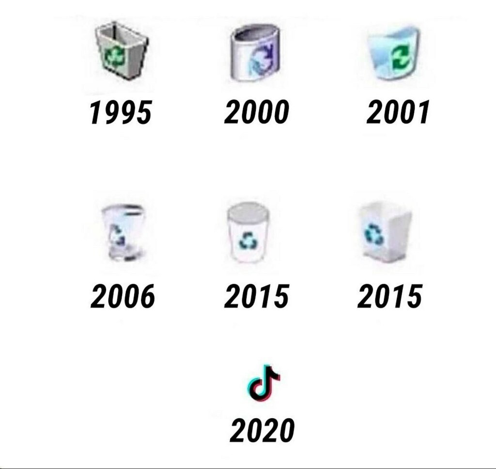
Who tf designed 2000?!
It wasn’t just for papers. It was a compost.
There’s a windows logo in it. Iconic.
A sophisticated self-own.
I wonder how much it will take people to realize that having 3 to 4 musk related posts on the frontpage daily is not how you get rid of him.
You’re right, it’s not, but ignoring him doesn’t get rid of him either. That’s not how capitalism works.
It is good to raise awareness of shenanigans. There are still people fanboying him simply because they are unaware.
You forgot Facebook Digg and now reddit
why is there some AI upscale fuckery going on here
Why is it orientated differently in 2000 and 2001 and afterwards normal again? What were they hiding and why? What is their secret?
95 was perfect. That edge on corner look was sharp as hell.
Of course it was sharp. There was no anti-aliasing.
ba da tss
The reddit dump truck?
Take my upvote.
