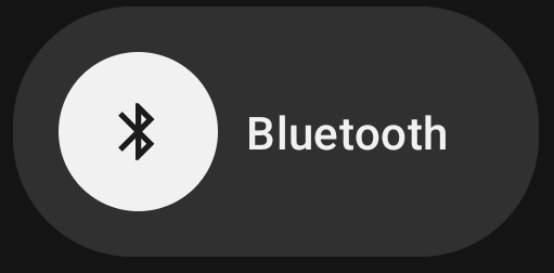
This toggle is annoying because what was once 1 press to turn on BT is now 2. It gets me every day.
I have the opposite. I have never a reason to turn off Bluetooth, but always want to connect of disconnect devices. this is so much better than long pressing.
Yeah they built this UI on the assumption that people didn’t turn off their BT generally. This is an improvement for me but I really don’t see why they can’t make it an option for people.
It’s not an assumption. They obviously have telemetry that shows the vast majority of people never turn Bluetooth or WiFi off.
…or maybe the people who turn off Bluetooth also tend to disable/block telemetry.
Unfortunately I suppose thats the equivalent of refusing to vote.
And that group is also an incredibly small outlier, and wouldn’t be considered in their calculations.
Ummm… this also happened for WiFi as far as I can tell…
Yeah I don’t turn that off generally either but you’re right the wifi panel has been like this for a bit and now it’s consistent.
My wife’s car is extremely aggressive. The second she turns it on, it steals my Bluetooth connection. I could be mowing my lawn, listening to music on my phone, then suddenly hear nothing, and it’s because my wife got in her car and was suddenly blasted with my tunes.
I tell my phone to forget her car’s Bluetooth connection, but then I’m constantly harassed by pop-ups on my phone every minute saying her car wants to pair with my phone. I can’t get it to stop pinging me. It sees a Bluetooth device in range and then spams it, trying to connect.
So yes, I like to keep my Bluetooth off until I want to use it.
Tell the car to forget your phone?
That’s a temporary fix, because oop may drive that car at times as well. I have the exact same problem
Have a dig through the cars Bluetooth settings and see if you can delete the pairing from that end.
I’ve done that, but it still pings every Bluetooth connection it sees, whether it recognizes it or not.
Her car had some class-action lawsuit recently because its integrated satellite radio service was constantly pinging for a connection, whether you had the service or not. If the car wasn’t driven in a few days, the battery would be completely drained. And you couldn’t jump it yourself; it had to be towed to a shop so they could use some special machine to jump and charge it.
That issue has been settled, but now its Bluetooth is basically doing the same thing. Fortunately only while the car is on, but still.
Sounds like you need to give it something to connect to. Buy a cheap analog-to Bluetooth transmitter, charge it from the car and just never turn it off. You’d need to do some research to find one which doesn’t go to sleep. If you need to use your phone in the car, just turn the transmitter off.
Hmm. Well that sucks.
Personally; I refuse to connect a phone to a car via Bluetooth. Too many reports of cars harvesting every available bit of info it can access from the connection and storing/uploading it inaccessible/immovable to the owner.
Aux cable, fm transmitter, or deal with the radio.
It’s a pain if you share a car. Whoever starts the car gets to interrupt the other one’s phone call.
Sounds like your phone is top priority. Either clear it off the car or move her’s up to the top spot.
Some cars it doesn’t matter - it will attempt to connect to whatever device it sees.
If it happens to see his first, it connects.
I’ve seen these problems for years with integrated BT in cars. I hate it.
The best answer I’ve found is to pair, then turn off all connectivity within that Bluetooth connection on my phone.
Does she have a mazda?? Mine does the same thing 😅
Nope, a Subaru. I drive a Mazda and I don’t have this issue.
Our car does this as well, but then when I get in it sometimes just refuses to connect automatically, so this actually helps me immensly.
I turn it off daily. I have 2 phones and I don’t want to connect my personal phone to my BT speaker at work. I can see where you’re coming from though.
I don’t want to connect my personal phone to my BT speaker at work
I’m confused, do you shuttle the same speaker between work and home or is work a separate speaker? If it’s a separate speaker why don’t you just delete it’s pairing from your personal phone?
I just leave it at work. I will do that lol. I forgot I could do that, thanks.
Supermarkets and malls etc, use Bluetooth beacons to track, and profile you. I’m always turning mine off, when in those kind of places.
I think this is the reason why Google implemented it. They already track you over Wi-Fi when you do not explicitly turn off the option, so Bluetooth is going the same route
I was like you once until I got a speaker for the bathroom and now the wife and I fight over it…
If we both have BT on, the speaker will connect to the last phone which is almost always the wrong one… And then the yelling fest starts so the other turns it off
Yeah. That’s my use case as well. I rather liked this. Even if I want to turn off BT, this is just one small button more that’s almost underneath the fingertip on my phone when you press the bt.
deleted by creator
I hated that too, but buried in the’edit’ list I still found separate toggles for WiFi and data (on Lineage OS)
deleted by creator
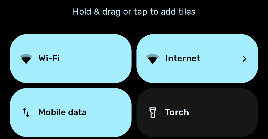
When you edit your quick-access tiles. Mine has a little pencil if I expand the notification area fully. I have these choices, where ‘Internet’ is the annoying combined WiFi/data button, but the other two were in there and I just had to drag them out instead.

deleted by creator
They used to be there and were removed a couple updates ago. Really annoyed me.
What’s even more infuriating is that the panel is blue even if both wifi and cell network are tuned off!
I would turn your yelling around: Do you honestly believe the vast majority of users need more than just that functionality, which beelines you into connecting to a specific Wi-Fi over toggling anything on or off?
Much like the Bluetooth menu, these changes are driven by the fact that the vast vast majority of users only ever need to access a quick “connect to this BT device” or “I want to connect to this Wi-Fi” menu. Never anything else.
It sucks as a power user, but at least for me I could find individual toggles when editing the quick panel.
deleted by creator
So now what would you do if the data were to show that the vast majority need fast access to a menu to swap which BT device is connected, but only few ever turn it on or off?
Wouldn’t it make sense to have the connect menu available quickly, and the on/off deeper in the configuration, just like you say it but the other way around?
Of course, 10+ versions ago the devs expected the toggle to be used frequently. But unless our users are a very skewed sample, fucking nobody (if you round it) ever does. Same with toggling data.
That’s a major improvement. Nobody turns off Bluetooth.
It’s now easier to check or disconnect devices.
Location and Bluetooth are constantly off for me, my phone is lucky if it isn’t in airplane mode.
Solely for battery lmao. I don’t know if it even matters anymore but it’s an old habit
It’s a good ol’ habit.
Yes we do. I have Bluetooth off 95% of the time, unless I’m using headphones
I like my battery more than I like my Bluetooth.
Bluetooth always off for me, until I need it. Then I’ll turn it on, then back to off.
 I like the way Nothing OS does it. Tapping the icon toggles Bluetooth on/off, and tapping the text/rest of the button opens the popup.
The fuck… now i understand why the hell sometimes it opens me that annoying window … It works the same on miui
Same on OneUI, it’s been part of the UX language for a while.
But the wifi button still pisses me off. I want my separate LTE data toggle back.
I actually have separate buttons for WiFi and data but they were buried in the ‘edit’ list
Not in stock Android 14 / AOSP
I thought Lineage OS was pretty close to AOSP, interesting to discover the things which have been added
Yes the buttons and the “long press power button on display off for flashlight” both small but soo useful things
Gad damn, I use that all the time!
Yup, an issue on the GrapheneOS issue tracker was closed, to implement this feature. Maybe giving it another try might help? Its damn useful and smart, as this has no function
Lineage OS based on Android 11. Pressing the icon toggles Bluetooth. Pressing the text opens popup. It works the same way also for wi-fi, mobile data and DND.

This I can agree with
The way it works right now on my phone is you tap it to turn it on and off and then you long hold to open the setting.
I’m going to be peeved if that goes away in favor of OPs process…
Yeah, long-pressing to open the menu makes intuitive sense regardless of whether you open the menu more than toggle.
That’s how my Samsung works too
I don’t want to go conspiracy theory, but in my opinion it feels like a dark pattern to increase the time people have Bluetooth on. I believe they did the same thing with success for Wi-Fi. If I recall correctly, even when you are not connected to a device, Google can estimate your location based on what Wi-Fi networks you are in proximity to and something to varying degrees might work for Bluetooth as well which is why they also roll the feature over to the Bluetooth toggle
Yeah, this is definitely it. This article is from 2019, so it has probably evolved a lot since then.
https://www.nytimes.com/interactive/2019/06/14/opinion/bluetooth-wireless-tracking-privacy.html
In addition to the profits from earphones, this is probably another reason for the removal of the headphone jack.
I could never go back to wired earphones though, they were way too annoying
Definitely dark patterns.
Not at all. That’s what people want. Nobody turns off Bluetooth.
Mine is off at all times. This is simply false as I am somebody.
I rarely turn Bluetooth on. Maybe 2 hours in a week.
That’s not what people want, that’s why this post exists and it has 69 comments so far.
And the most upvoted comment agrees with me.
Who says that that kind of stuff on Lemmy of all sites?
Then why do I have non-tech people in my life complaining about these toggles within toggles?
For those that want it always on, they could do so just as easily before the update that adds a layer of obfuscation. This is not about what people want.
If you wanted that, you’d simply just leave Bluetooth toggled on and take it off your top quick toggles.
They already do that regardless of the state of those toggles. You have to turn that off in a different spot.
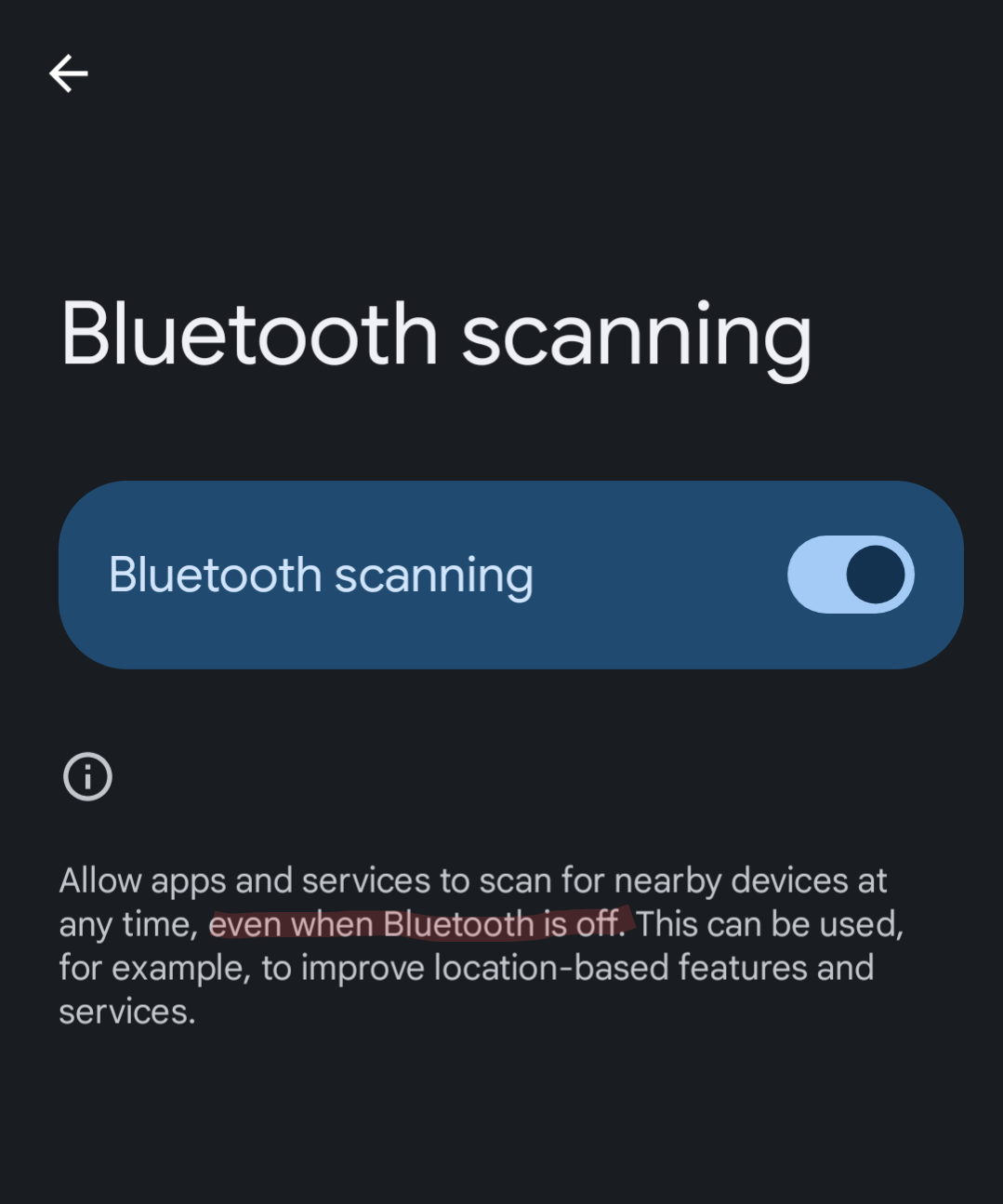
The main Bluetooth and Wi-Fi toggles otherwise just stop your device from actively associating/pairing with other devices. They do not control the radios.


Thank you for this! I just turned them off. Such bullshit.
Wut. Why would they bother when your cellular connection is constantly pinging all towers to literally triangulate your location? Why do something much more complicated to get data they already have?
The real answer is they are a multi billion dollar company with telemetry. Obviously, the vast majority of people never turn off WiFi or Bluetooth. Most people want quick access to connect to a WiFi network or Bluetooth device, not to toggle either off.
I believe that Wi-Fi points are more accurate than towers especially when they’re sharing the information with indoor retailers
It’s just a usability improvement. Virtually nobody turns off Bluetooth.
Keep saying it. It’ll be true eventually.
Damn, somehow this place is more toxic than Reddit used to be.
What
I have literally never turned it on
It wastes battery and offers literally no benefit whatsoever
Would you shut up already?
Bluetooth give a lot more information about your surrounding (what device your phone detect or connect, for how much time, distance from objects, etc.), not only from your phone alone, but from other people phones who have bluetooth on and e.g. never disable any tracking from google services too. And the Mac address for bluetooth never change, so any device (and tracking company) will know you is forever you. Bluetooth is a privacy nightmare, and this is totally a dark pattern. People not knowing what they’re doing is of course a thing, but it seems just a usual bad practice by google, who like to manipulate especially not tech-savvy people
I was just grumbling about this today. It’s one of those little changes that might help someone, but interrupts a flow that worked well for me.
Same. I was sure it’s me doing something wrong.
But I don’t even like those larger icons. I want the smaller circles like before.
Can we talk about how space inefficient the UI is? It takes up the entire screen to essentially show 6 buttons. And I bet like the Internet toggle that it moves the buttons around when it detects new networks
It’s actually 9 buttons + DONE button. Each device has the option to connect to it by clicking its name, or enter Settings by tapping on its gear icon.
I stand corrected. My brain must’ve been switched off at the moment.
That was my first thought. Which skin of Android is this?
This is not a skin, it’s a pure android probably on pixel device
Ah right! I’m a fair few versions behind now so didn’t recognise it.
I think Android 12 is where this was introduced, and 13 where they made the buttons even bigger
I prefer this. I’ve been annoyed by having to go to the settings every time I wanted to swap device I want to connect to. I rarely turn off BT anyways.
Before it was a single tap to turn Bluetooth on/off, and a tap+hold to open the Bluetooth settings (or any quick setting tile in your notification tray). Maybe you just didn’t know about that feature but the old way was 100% better.
I knew about it but still prefer this new way
I miss the 6 small buttons
Going through the comments, I think it’s clear to conclude this should be a choice to configure this tile. Some people prefer single tap to turn off, some don’t
I honestly thought this was my own doing and was about to go insane when I couldn’t find the setting to revert this. Why on earth would they do this…
I’ve felt this a lot over the years. Regressions in interface designs happen here and there, and I feel it’s just people justifying their jobs. We have to change this, and that, and EVERYTHING, to keep it fresh. Where in reality, sometimes only some things need changing.
I put buttons on screens for people at work and I’m imagining the fury that would rain down on me if I put 2 buttons in place do a normal thing that was once one button. I would never hear the end of it.
Fuck this noise! Hate it.

What version are you on? 15? I’m on 14, and for me it’s as it ever was. Also, can you replace it by editing the Shortcuts? I was able to replace the Internet thingy with separate toggles for Mobile Data/WiFi by doing that.
Hello, fellow kde connect user.
Uh, this is kinda awkward, but I actually use a Gnome extension to be able to use KDE Connect.
Edit: Oh, wait, I read KDE instead of KDE Connect. Well, ignore the above, then.
I’m on 14 on a Google pixel 6 pro. I tried what you suggested but there’s no option to alter it, but thanks.
Hmh. Annoying. I’m on lineage, and I noticed that the stock Pixel Rom seems to be more limited like that in some ways.
I’m on 14 but on a Pixel 8 and it’s like OP shows now. Clicking the button on the quick menu just opens the screen OP is showing instead of turning off the BT radio like it did on my previous phone, which was also on Android 14.
For some reason, certain features and UI changes don’t happen for every device even if they’re on the same version of the OS. Like every phone maker has their own tweaked version of it for their specific phone, and it’s not a universal experience for everyone just being on Android.
I mean, sure, but both lineage and the stock rom on pixels should be reasonably close to stock Android, compared to stuff like, for example, MI UI.
The “stock” rom offered by Google’s own devices seems “enhanced” to the stock android given to any other device. But even between them, there are odd differences. My sister has a Pixel 7, just 1 iteration behind mine, and on the same OS version; but the UI isn’t exactly the same. I can see special apps not being for hers, like Gemini (and even features of Gemini I do not have but the 8 Pro does); but for the basic settings menu and quick menu and shit to be different is weird as hell.
Yeah, dunno what Google’s on. I’ve noticed that on my brothers pixel, it’s not possible to deactivate the visual guide in the bottom of the screen for gesture navigation. The option just doesn’t appear in his settings. It’s all a bit silly.
And then they don’t toggle where you want to toggle (a connect / disconnect on each device) so you have to tap and guess or open settings anyway
It follows the pattern for WiFi/Internet.
Which was also a terrible change.
This was my thought. I often turned my Bluetooth off while trying to switch devices because of habits from the Wi-Fi
I appreciate the consistency. I’ve turned off Bluetooth accidentally too.
?
Does it not turn on Bluetooth before opening that menu?
It does for me.
Bluetooth on: single tap turns it off.
Bluetooth off: single tap turns it on and opens that menu so you can select a device to connect to. (it still connects to the last connected device automatically) From there tapping back or tapping beside it closes it.
Been that way for several years now. (Samsung A54, and A52 prior to this one)
Not on my Pixel 8. Single tap on the Bluetooth button only opens the Bluetooth connection screen with a separate toggle to actually turn on Bluetooth once you’re in there. Google likes to do things the hard way.
Ah… Google devices…
I’m much less confused.
deleted by creator
I just drag down from the top of the screen, and tap the Bluetooth button. That’s it. The Bluetooth connection screen pops up, but that doesn’t turn on Bluetooth. I have tap the toggle to actually turn on Bluetooth, just like OP describes. I have a Pixel 8 with stock Android 14.
Nope.
deleted by creator
You have a Samsung, so you can avoid Google’s UI dumbing down.


