

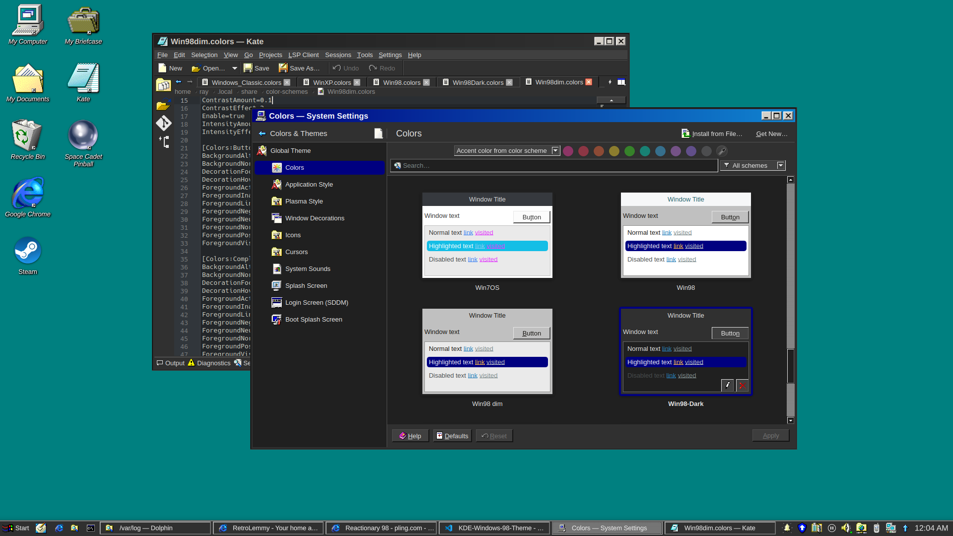
EDIT: v0.9 released
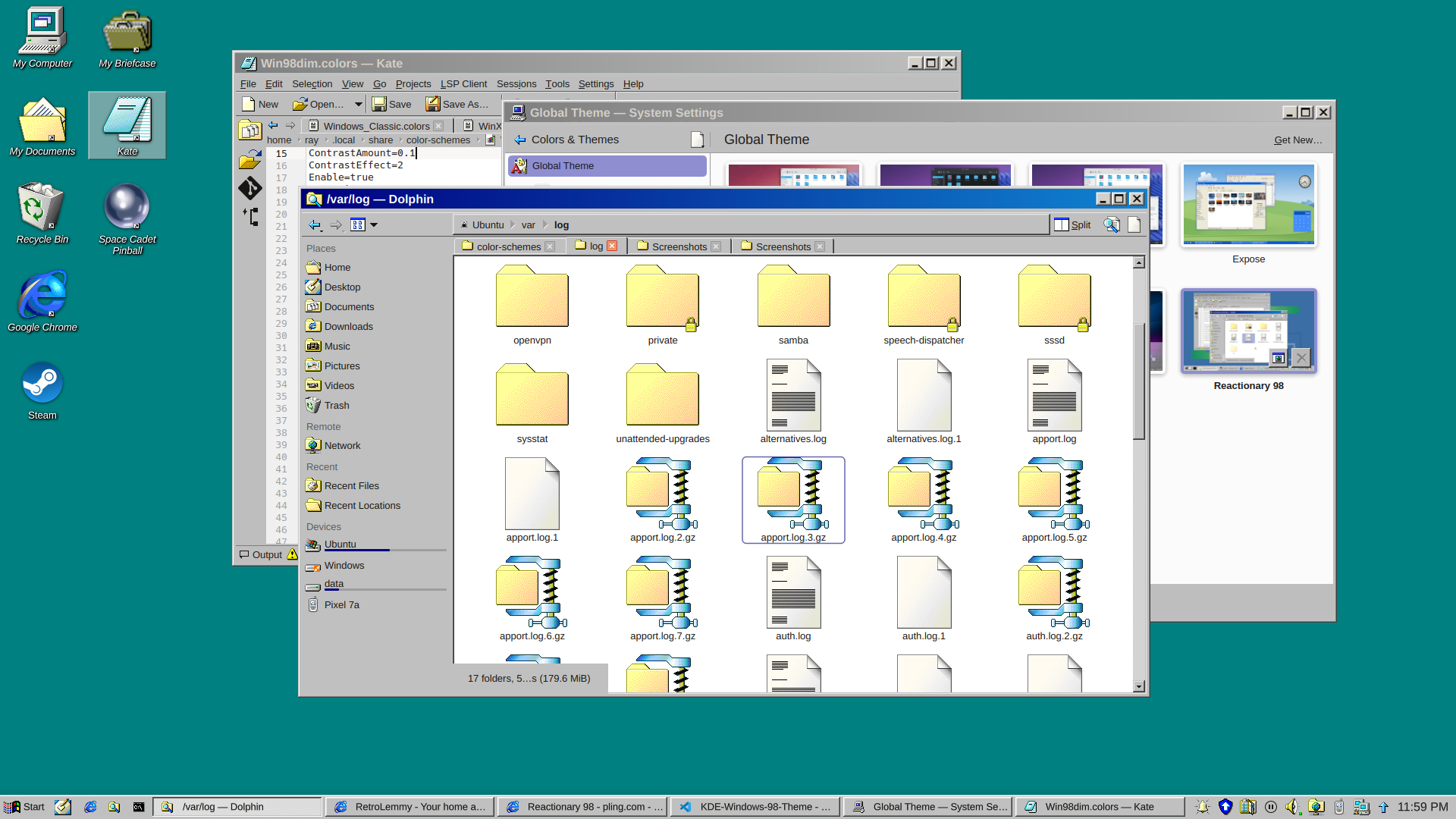
and a dark version
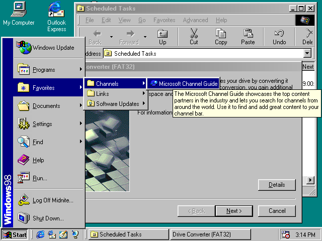
I really just put a bunch of pieces together. Forked from Reactionary Plus, but swapped out the icons, cursors, window decorations, color scheme, and made some slight tweaks to the layout.
More screenshots and changelogs here: https://store.kde.org/p/2330858
To install this, open System Settings, go to Colors & Themes -> Global Theme. In the top right there’s a button for “Get New…”, wait for it to load (it’s very slow) then search for reactionary, and wait again, then install Reactionary 98.
This is my first time messing with any of this stuff, it was a bit janky lol.
Thanks, I hate it.
Yeah. I installed it out of nostalgia and once it was all set up I used it for about 30 seconds and switched back.
This is really cool! But why?? I mean why win98 of all things?
Lol I think it’s the best looking Windows
I agree. I used windows classic as long as it was supported. Sadly they stopped supporting it after windows 7.
“Your scientists were so preoccupied with whether they could, they didn’t stop to think if they should.”
Only has the functionality that you need, everything is obviously in its place. Runs incredibly quickly without using a lot of resources, and then gets out your way when you’re trying to do stuff. No settings hidden away because they might confuse novice users. No bullshit shoehorned in by managers.
Apart from the ugly font rendering, this might be as good as the Windows UI ever got. WinNT looks the same and has almost incomparable stability improvements, but only if you’ve the right hardware to run it. WinXP starts the downhill slide with ‘appearance over functionality’ and the hot mess of the control panel.
I could live with how OP has things set up here; my own copy of Plasma doesn’t look a million miles from this.
Windows 98 had god usability. The buttons and controls all had borders, so you could know where they are. In Windows 11, everything is flat, nothing has a border, so you can never know where the interactive area is.
tbh it doesn’t really accurately look 98, especially the taskbar, but it still looks great. nice functional unix desktop.
thanks, I actually did manage to improve the taskbar a lot for v0.7
Wouldn’t an exact replica be technically illegal?
well if you slap microsoft’s logos on it well maybe, technically… but who cares?
even back in the days there were a LOT of unix desktops made to look like windows as now. try searching fvwm95 for example
I certainly wouldn’t call that pixel perfect either though.
Am I weird for actually wanting to use this out of nostalgia? I distinctly remember thinking at the time that the gradients on the window bars were the coolest thing ever, especially because you could configure them to be whatever wacky colours you wanted.
I’ve tried a couple versions of this out of nostalgia a few times like using chicago95 and some other custom options. you can pretty much get it right to the classic feel of old Windows GUI’s but then you start using it and think “how did I ever use a PC like this?” especially when you’re so used to minimal tiling. it’s fun for a bit but I always just ended back to like sway or something.
I don’t personally have any nostalgia for the Mac interface, but I do wish Plasma 6 had a good latte-dock replacement.
In my mind it’s weird to use any light theme at all now that dark themes are widely available, but if you are going to, this isn’t any weirder than any other.
Another disadvantage it seems to have over many other themes is that in tabbed interfaces there is no color bar on the currently active tab, so you can’t spot the currently active tab as quickly.
In my mind it’s weird to use any light theme at all now that dark themes are widely available
Dude, preferences. And not everybody uses their computer in a dark room.
It isn’t any of my business whether other people use light themes… but IMHO dark themes are just so much easier on the eyes, no matter the surrounding light, that I don’t get why anyone would if they have the option.
For me, light themes are easier. Especially jarring, if a website forces a dark theme on me (theres’s a easy-to-use @prefers-color-scheme, use that, will ya). And syntax highlighting on dark just doesn’t work for me, no matter the scheme.
Dark theme is hard to read in a brightly lit open office with sunshine. Your pupil contracts and then dark stuff become really hard to make out, especially interfaces where they have blue in black.
Thankfully my GNOME desktop has a toggle of light dark that is super accessible, and I can swap as the lighting conditions change in my office.
I was contemplating how to make a dark version of this lol
If you come up with one, I might start to use it. I generally like the classic Windows style because the first computer interfaces I ever used looked like that, but nowadays I definitely insist on dark mode.
How’s this? added in v0.7
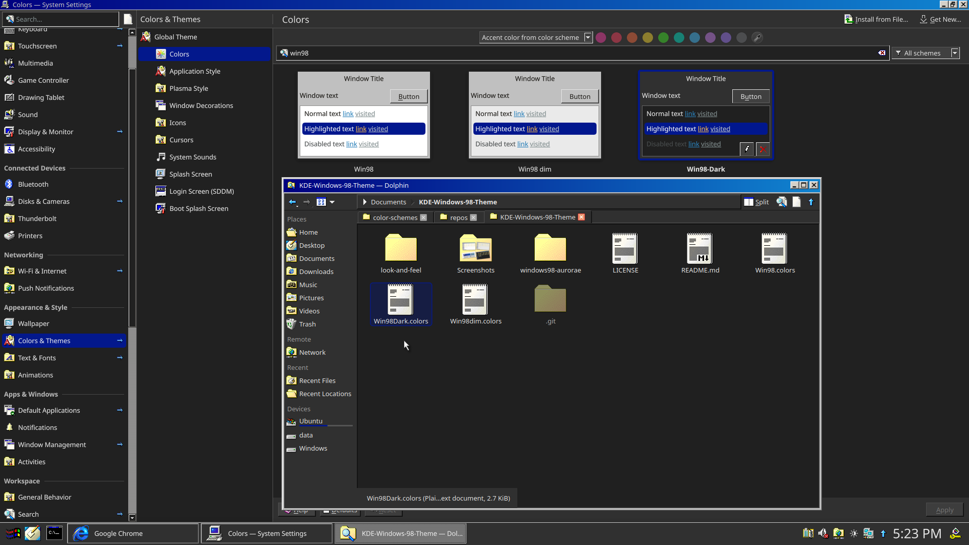
That looks good, I might try it over the weekend. :D Thanks for the effort.
I’m also uploading v0.8 with darker borders too, unfortunately that’s a separate package from the colorscheme, it’s built into the svg file in Window Decorations
Looks really good
That intern*t expl*rer icon is actually very triggering
you had me at

For some unexplained reason this is making me unreasonably angry…
Now make Windows 7.
Someone already made it: https://github.com/WackyIdeas/aerothemeplasma
That’s really well done! It’s not crunchy or gross around the edges. It’s completely seamless and clean.
And a delightful way to screw with scammers. Bwahahaha!
What the hell? It looks insane. How have I not seen this before? Will need to check it out later. Thanks for sharing!
Nice nostalgia trip. But there’s way too much vertical padding on the title bars.
I tweaked it slightly, I think the titlebars are pretty accurate now, at least proportionally
Windows 98:
my theme v0.9:


